INTRODUCTION
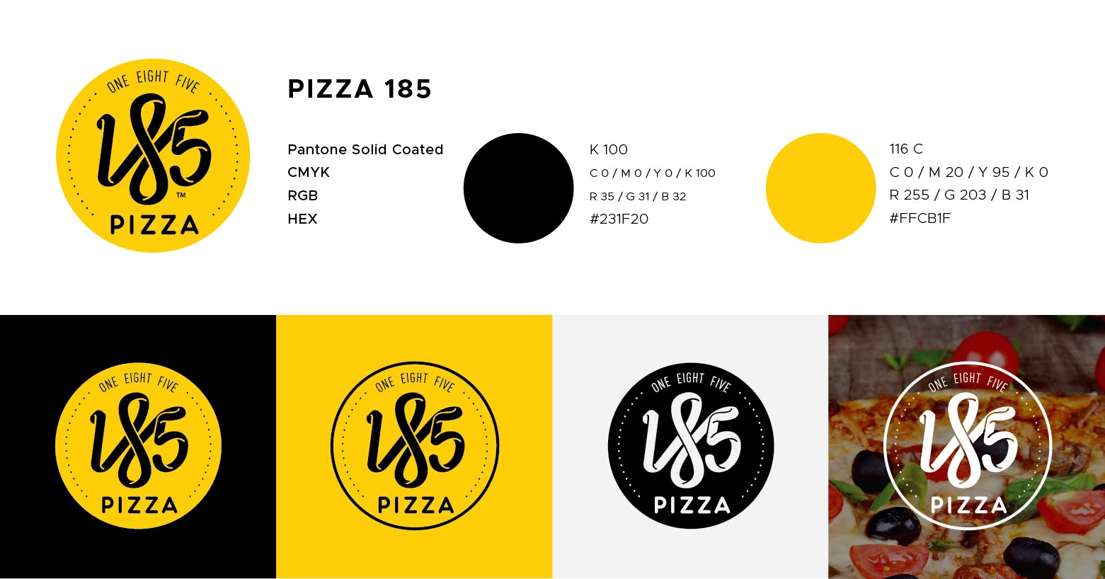
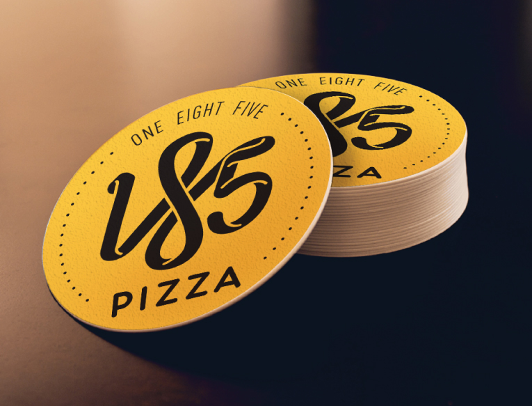
The Pizza 185 is a Pizza restaurant that has their mission in their names.
1 is for a string of dough that represents the base that unites the food and the people together.
8 symbolize the infinite pizza and culinary creativity that will take your taste buds on a unique exotic ride.
5 represent the continents that Pizza 185 aspires to spread scrumptious, unique food and celebrate the happiness of every dish they create.
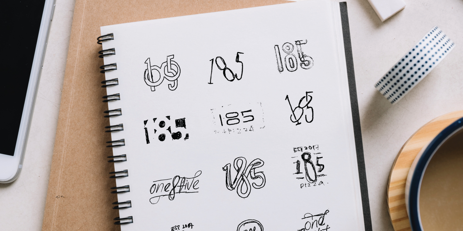
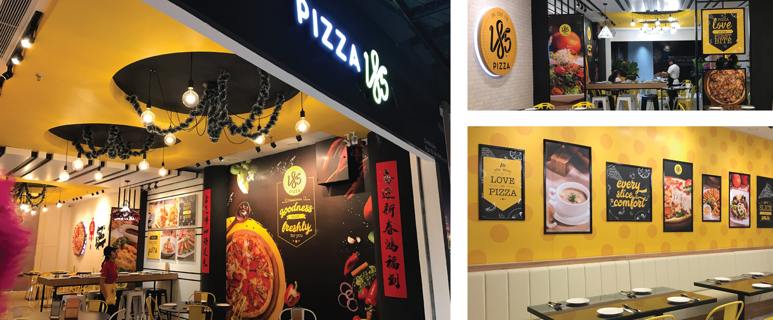
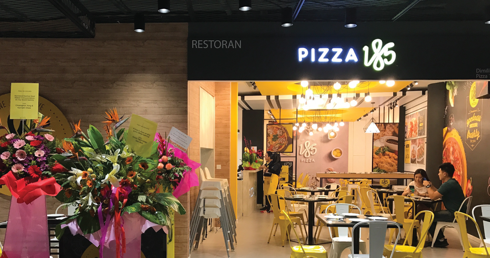
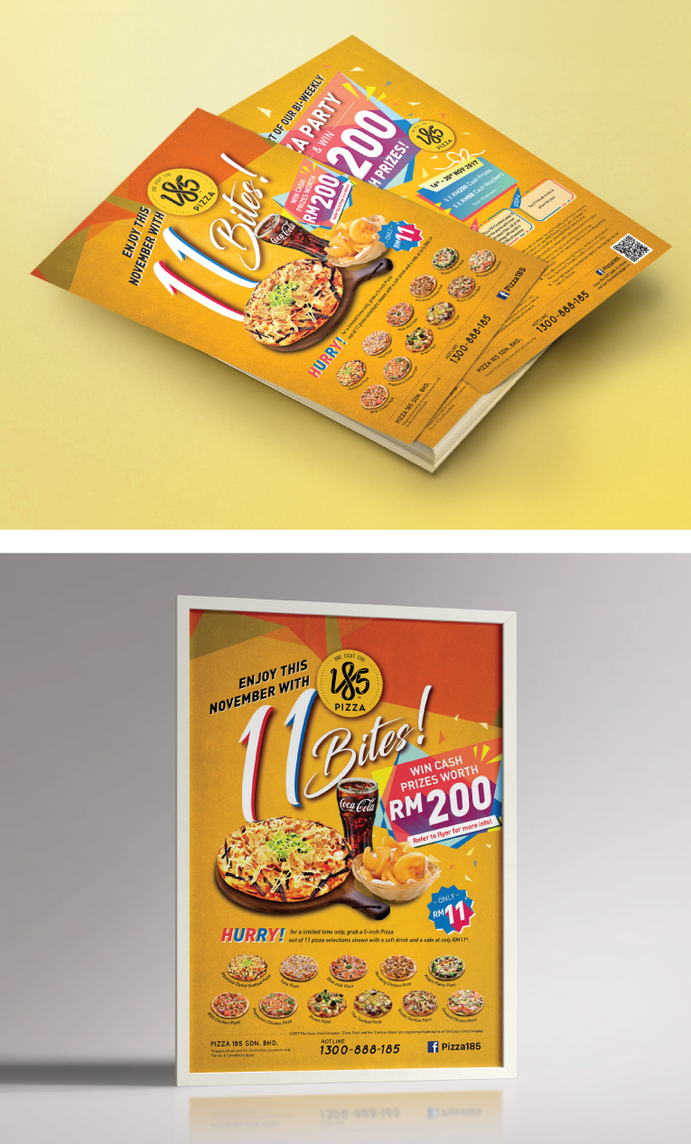
WHAT WE DID
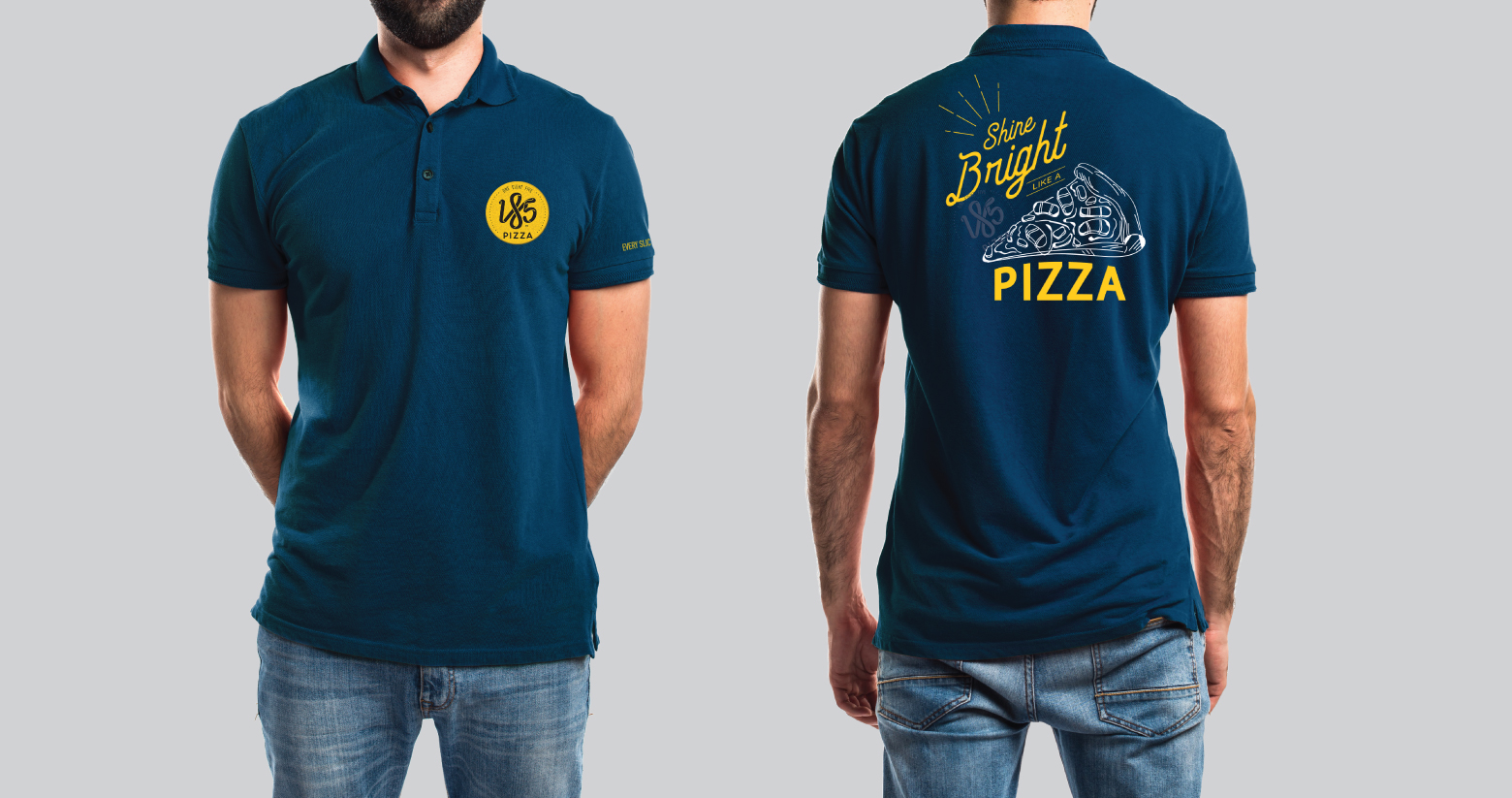
It was an absolute pleasure to begin a branding for a New Premium Pizza Restaurant. The client gave us creative freedom with a clear direction to help us with our creative process. Though we found designing with numbers is a bit of an obstacle for the designers still we tried our best to look through that and create a meaningful brandmark.
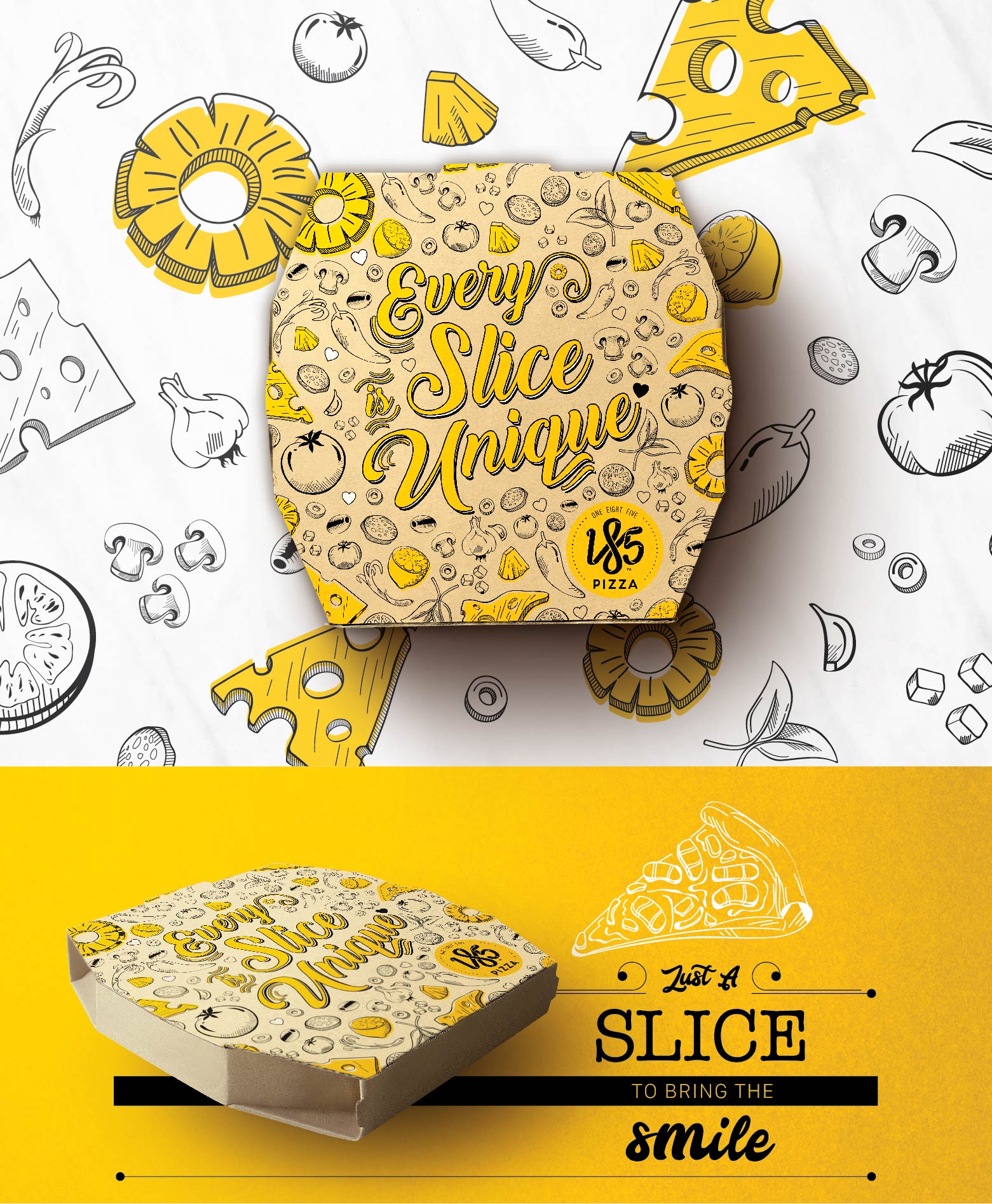
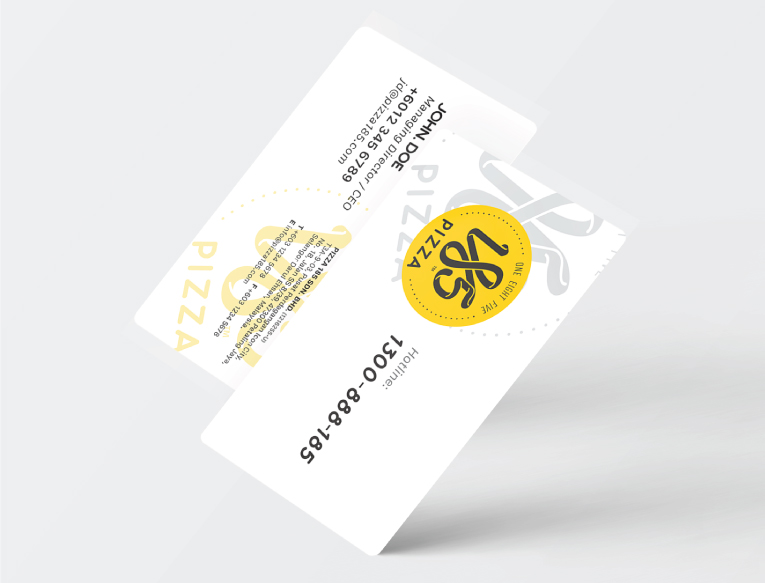
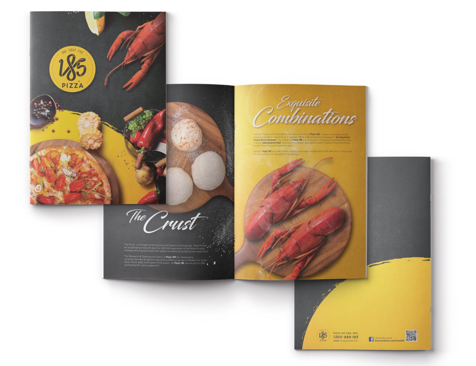
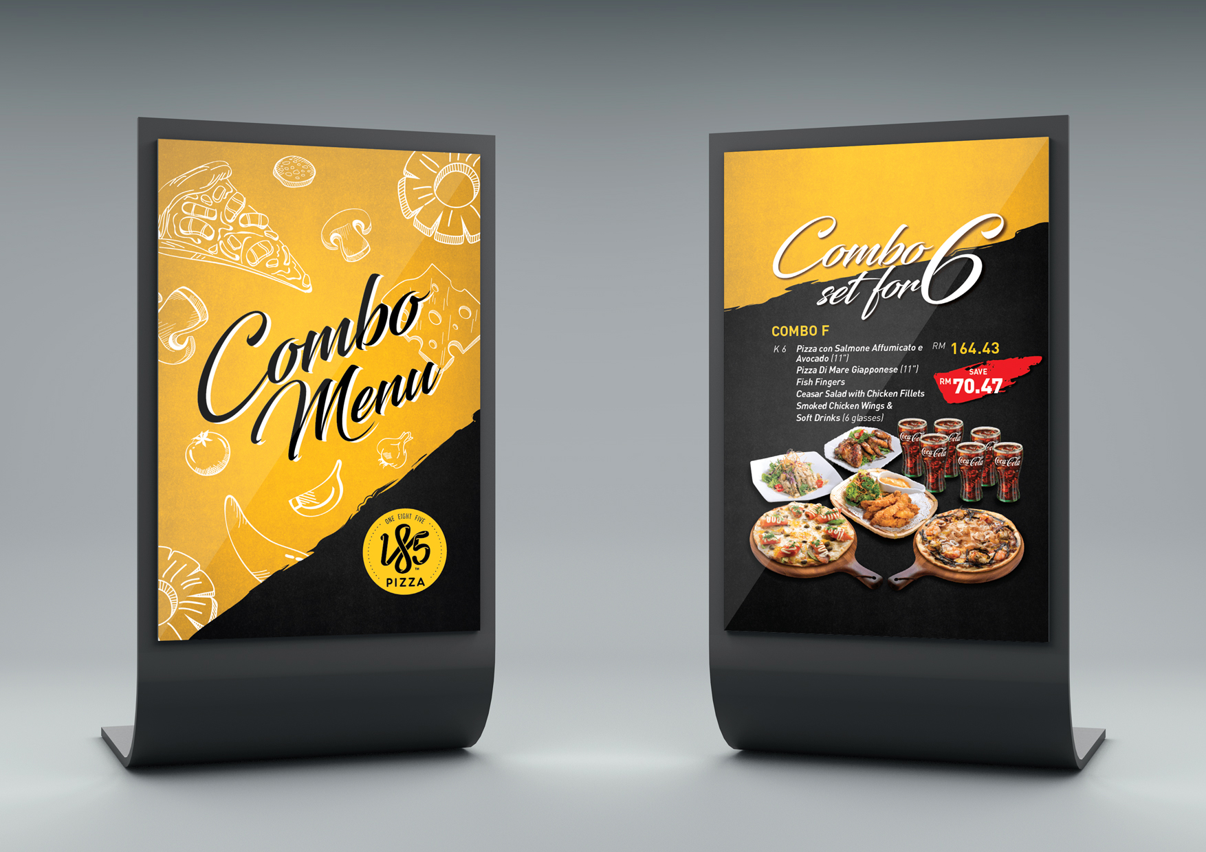
The client was very helpful and fast with feedback, which made the whole process move swiftly without any trouble. We were involved in creating their Corporate Identity System, Restaurant’s Environmental Graphic, Menu, Promotional Collaterals, Social Media Micrgraphics and Post.